Airmee Driver App
@Airmee, UI/UX Designer — 2020 to 2021
Airmee is focused on creating the best last mile logistics service in the industry. Once a customer chooses Airmee home delivery at checkout it’s our platform which takes over and makes sure the order is picked up and delivered on time. To enable this Airmee has a dedicated driver app which provides the delivery information to our drivers.
A complicated problem
The complexity of logistics is, well — a logistical nightmare! Each arrow in the previous ecosystem map represents a transfer of goods which can only be completed with a driver. And the Airmee driver app is the key piece of technology which makes it all happen.
A typical shift for a driver may look like this:
→ Pickup items from the warehouse
→ Deliver items to customers
→ Pickup express orders from retailers (and deliver to customers)
→ Pickup returns from customers
→ Bring returns and failed deliveries back to warehouse
All these steps need to be handled by the driver app without much assistance needed. Designing for all the complexity is challenging and that’s where I come in the picture.
I joined Airmee in Feb 2020 (on my birthday of all days :D) as the first in house designer of the company. Before me there was no product team and it was handled directly by technology teams implementing features requested by the on ground operations team. This worked for a while when the company was small but as they scaled - simply adding features and steps became a big burden. Feature creep, complicated flows and major usability issues were some of the problems I dealt with.
Product goals
Airmee’s goals as a startup were single focused — profitability. One of the methods to achieve their goal was to reduce operating costs. This laser focused goal translated to clear product objectives for the driver app:
→ Decrease time per delivery
→ Increase deliveires per hour; and
→ Reduce calls to dispatch team from en route drivers due to problems
It was clear that the driver app had to be improved quite a bit to achieve these goals. However, being a startup we had a small tech team and a complete redesign was not possible — we had to incrementally improve features and iterate quickly. With these objectives and constraints in mind I began my research into understanding the problems faced by drivers everyday.
User research - going for a ride!
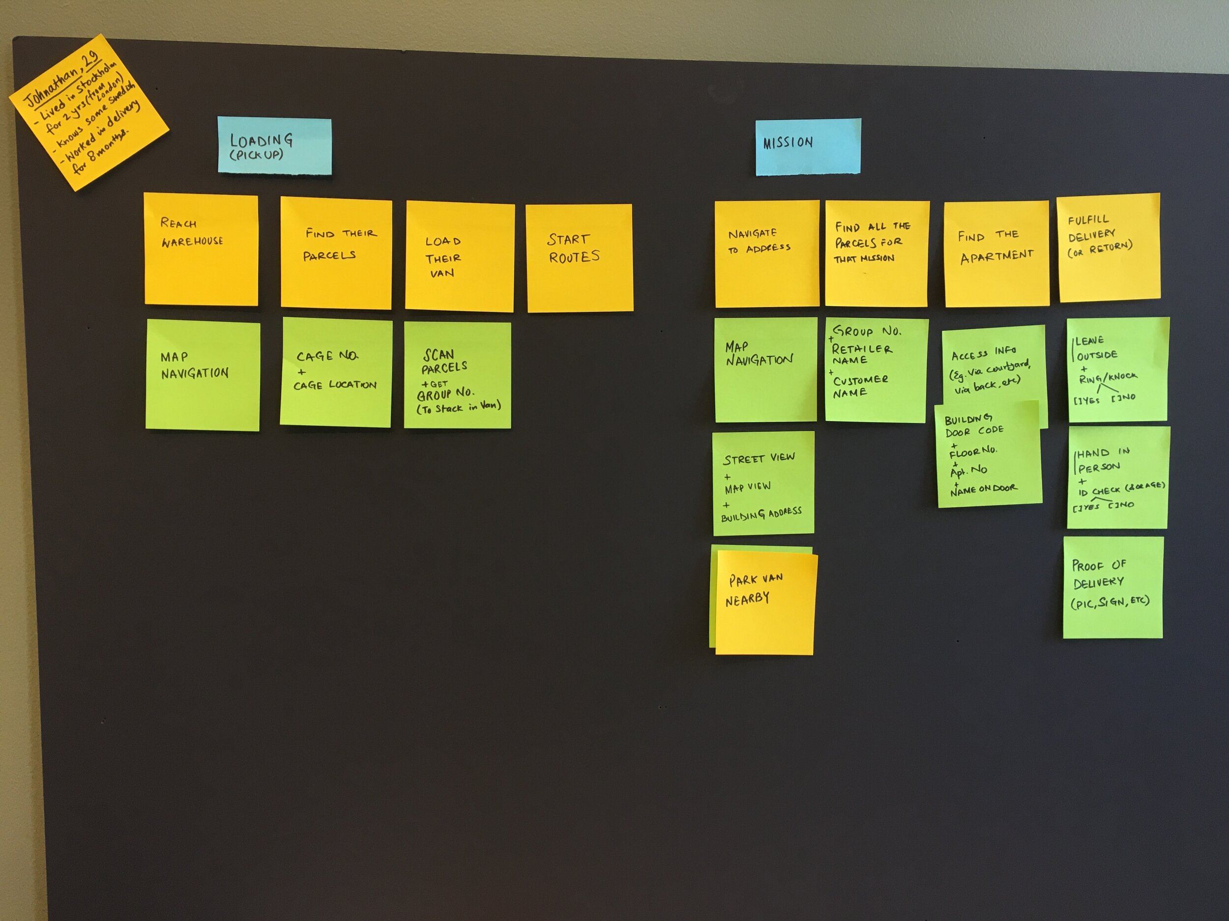
One of the best ways to research the issues being faced by the drivers was to go on actual deliveries with them! I rode with real drivers on real shifts and equipped with a notebook (or sometimes the Notes app on my phone) took notes as they completed each delivery. It was an intimate learning experience where I got to observe the whole picture of logistics in real time. Some things I paid attention to were — information needed by the driver at different points of the delivery, how drivers manage the pace of deliveries during their shift, edge cases faced very often, etc. I also spent time with the dispatch staff and interviewed them to know frequent issues for which drivers contacted them mid-route.
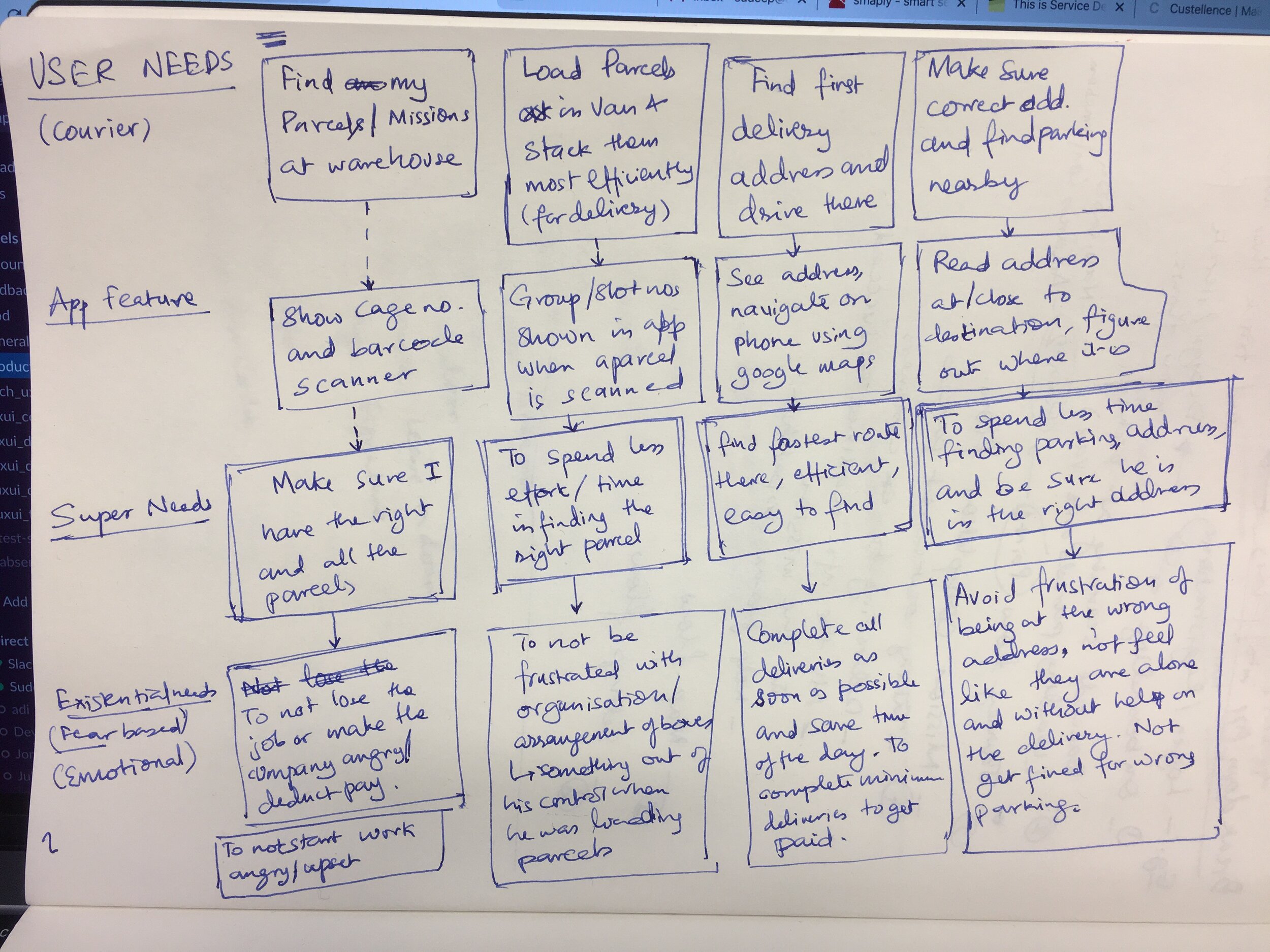
Some key learnings from my user research were:
→ Drivers are under considerable time pressure.
So they need clear instructions and features that handle real world edge cases smoothly
→ Drivers like to see an overview of the delivery when they start.
Many drivers made a mental note on key pieces of information and didn’t like to be handheld
→ Any information needed to complete a delivery should be easily accessible.
→ Delivering is a moving environment - readability is key to quickly find information.
They don’t have time to stop and read instructions
Riding with the drivers helped me make an accurate user journey map which served as a common resource in the product team. This method of research with the drivers and dispatch team was an ongoing process which came in handy during the many smaller features I designed which eventually led to the app (re)design.
Another way to get feedback was through dedicated Whatsapp groups where drivers could lodge complaints after we released a feature.
App (Re)Design
After almost a year of implementing smaller feature improvements and getting a better understanding of the problem, I designed the final version which is almost like a redesign with its fundamentals rooted deeply in user research and our product goals.
App Screens
The mission list is the main view for drivers to find their entire shift and delivery route. As each delivery (we call it mission) is completed it is removed and the next delivery is ready to be completed.
Mission details page lets the driver know the details of the address and the order. This page is used by drivers to get to the right address and to get the correct parcels from the van. A “Group” letter denotes which part of the van that delivery was loaded in the van — making it easy to find the parcels quickly.
Once the driver has the right parcels they will use the entrance details page to enter the apartment building. This page also displays the last steps that a driver has to take like ringing the door bell or checking IDs.
The previous page allow the driver to enter the building and while on the way they can scan the parcels as a verification step.
After the driver scans the parcels they are once again shown the entrance details screen because they need information to find the right apartment and be reminded to ring the door bell.
After the driver finds the right door then they have to complete the last step of checks — ID, age or signature. After checking these details the driver can mark the delivery as complete.
Outcomes and learning
The design changes in the driver app brought dramatic improvements in driver performance from Jan 2020 to Jan 2021:
→ Time Per delivery reduced by over 50%
→ Number of deliveries per hour increased by over 60%
→ Much less help needed from dispatch team
The entire year of designing the app has taught me several lessons in product thinking and designing for complex workflows:
→ Real world logistics is complex and messy. Competitive advantages lie in understanding these complexities and simplifying them to create scalable solutions.
→ A good designer needs to consider the entire ecosystem of connected people and products while working on complicated systems.
→ Good design can elevate user experience along with achieving the economic objectives of a business.
This was a great learning experience for me to craft design solutions amidst chaos and complexity. The app continues to be tweaked and improved at the time of writing this case study.


