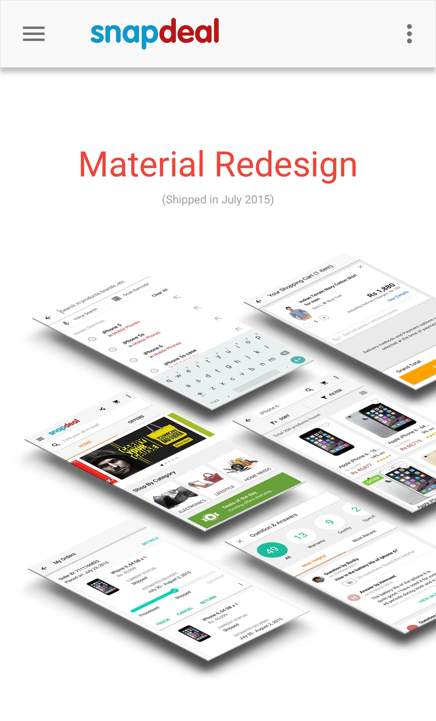
The material push
The redesign was part of an ongoing design revamp at Snapdeal. The aim was to improve the Android app’s navigation and ease of product discovery. We chose Material Design to stay ahead of the curve among e-commerce companies in India and Snapdeal was one of the first to adopt it.

HOME
The home page page starts with a useful header design. Search, Home and Offers are present on the first third of the screen to guide a user to the most useful sections of the app. Shop by Category leads the user navigate and browse through various categories.
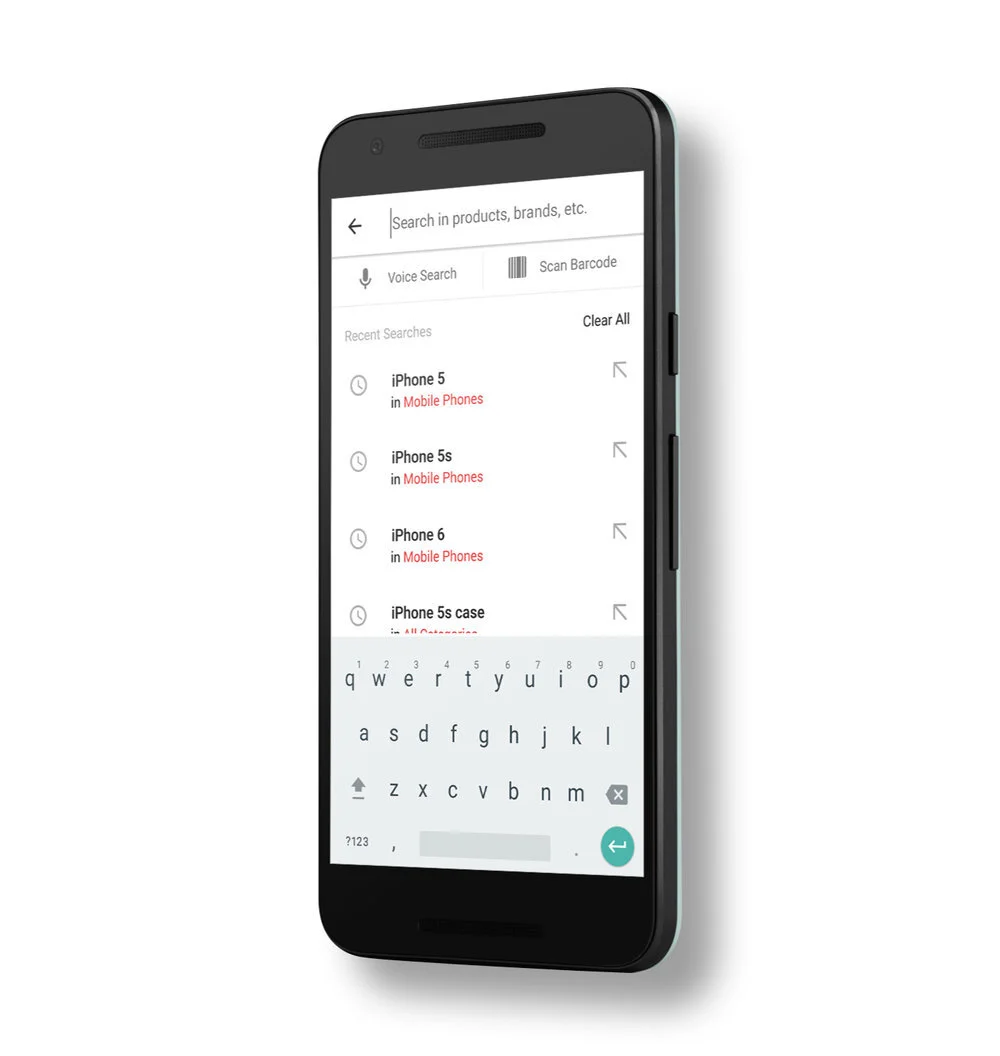
SEARCH
Search was built keeping in mind two things: speed and recollection. The recent searches section provides search terms along with relevant category names to keep the context of the previous searches easy to remember and the user can continue his journey from where he left off.

NATIve Cart
The cart was one piece of all Indian e-commerce apps that, at the time, had always been built on web-views. We decided to be the first to change that. Going through several iterations of long and short versions; payment and delivery options; and offers and discount views - the native cart was challenging to get just right for such a huge audience like Snapdeal’s.

Tracking
Accurate tracking and cancellation/return options are very important for a trustable and delightful customer ordering experience. The design reflects Snapdeal’s efforts to offer maximum transparency and precise state of the package to the recipient.

Complete Overhaul
All the pages of the app were redesigned to meet the new design language and help in establishing a superior and consistent user experience.
While working on this project at Snapdeal, I understood why e-commerce is one of the most challenging and vast areas of user experience design. To help re-design one of India’s leading online buying platforms was one of the most satisfying learning experiences for me.